
This post contains affiliate links. As an Amazon Associate, I earn from qualifying purchases — at no extra cost to you.
Two people can buy the exact same print and end up with two completely different walls. One frames it in whatever’s cheapest and hangs it a little too high, and it reads like a dorm room. The other spends the same amount of money differently — a slightly better frame, a wider mat, a picture light instead of an overhead spot — and it reads like something that’s always been there. The print was never the variable. Everything around it was.
That’s the part nobody mentions when they’re telling you which print to buy. So this one isn’t about which print. It’s about the five decisions that happen after you’ve already picked one — for a print from the shop or anywhere else.
The frame itself
Skip anything glossy, anything chrome, anything that looks like it came out of a big-box frame aisle in a stack of forty identical ones. What reads as intentional is a frame with some visual weight to it — a deep matte black with a slight profile, a warmed pewter, or real or convincingly real dark wood with actual grain visible. Thin, flat, poster-frame aluminum is the single fastest way to make a genuinely good print look like a dorm-room afterthought.
You don’t need ornate. Gilt and heavy carved detail pull the eye away from the print and toward the frame’s own decade — usually not the decade you’re going for. A simple profile with real depth to the moulding does more than an elaborate one. This walnut 11×14 with real grain and tempered glass is the shape of thing to look for. Shop this walnut wood frame →
The mat, and why wider is usually right
A print with no mat, pressed edge-to-edge against the glass, almost always looks cheaper than the same print with two or three inches of breathing room around it. The mat is doing the same job white space does on a page — it tells the eye where to stop, and it gives the print room to be looked at instead of just seen.
Go warm, not stark. A bright white mat fights a dark print; a cream, bone, or warm-grey mat lets the darkness of the image stay the darkest thing in the frame instead of competing with a mat that’s brighter than the wall around it. These acid-free ivory boards run genuinely warm — closer to old paper than to white — which is exactly right against a dark image. Shop these warm ivory mat boards →
Glass that doesn’t turn the print into a mirror
Standard picture glass throws back every light source in the room, which means a print hung across from a window or under a ceiling fixture spends half its life reflecting the room instead of showing the image. Non-glare or museum-style glazing costs more per frame, but it’s the difference between a print you can actually see from across the room and one you have to stand at an angle to look at.
If budget only stretches to upgrading one frame’s glazing, upgrade the one going somewhere with direct light — a hallway, a spot near a window, above a mantel across from the main window in the room. A non-glare acrylic sheet cut to your frame size does the job for less than museum glass, and it’s lighter and safer to handle. Shop non-glare acrylic glazing →
One picture light, not an overhead spot
The overhead-light rule that applies to a whole room applies just as much to a single frame. A recessed ceiling spot pointed at a print washes it out and flattens it exactly the way an overhead fixture flattens a room’s color depth. A small picture light mounted to the frame itself, angled down, does the opposite — it creates the kind of warm, slightly uneven pool of light that makes a print look like it’s being appreciated rather than illuminated for inspection.
This is the cheapest upgrade on this whole list and the one most people skip. A rechargeable one means no wiring and no electrician — it mounts to the frame or the wall above it and just works, which matters if you’re renting. Shop this brass picture light →
Hanging height, and the hardware that gets it right
Center of the artwork at roughly eye level — about 57–60 inches from the floor to the center of the frame — is the standard for a reason: it’s where the average adult’s eye actually lands without tilting the head. Above a sofa or console, the bottom of the frame should sit 6–8 inches above the furniture, not floating a foot above it the way a too-small frame on a too-large wall always ends up.
A single D-ring on each side with picture wire, rated well above the frame’s actual weight, hangs flatter against the wall than a single centered hook — and a small strip of removable putty or bumpers at the bottom corners keeps it from tilting forward over time, which is the thing that eventually makes a frame look neglected even if nothing else about the room has changed. One kit covers every frame in the house. Shop this D-ring and wire hanging kit →
A word on the print itself
If you’re printing at home rather than through a print shop, select Fit, not Fill, in your printer settings — Fill crops the image to force it into the paper’s exact ratio, which is the single most common reason a home-printed piece arrives looking cropped wrong compared to the preview. A proper print shop or lab handles this correctly by default; printing at home is where it’s worth double-checking before you commit ink and paper to a size that clips the composition.
Where I’d start
If you’re only doing one thing, do the mat — it’s the cheapest change on this list and it’s the one most people skip entirely, hanging prints edge-to-edge in the frame because it didn’t occur to them there was another option. The picture light is the second-cheapest and the one that makes the biggest difference after dark, when it’s actually doing its job. The frame itself is worth spending real money on once, because it’s the one piece here that outlasts every print you’ll ever put inside it.
A wall built this way doesn’t look decorated. It looks like it happened slowly, one good decision at a time — which, for a room whose whole point is looking collected rather than shopped, is the only test that matters.
From the shop
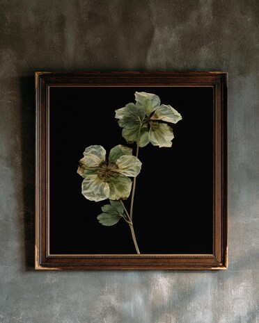
Prints from our own Duskwood Fell shop that suit this room. Instant digital downloads, printed at home or at any print shop.


This post contains affiliate links. If you buy through these links, I earn a small commission at no extra cost to you. I only link what I’d actually use for a wall like this.