This post contains affiliate links. As an Amazon Associate, I earn from qualifying purchases — at no extra cost to you.
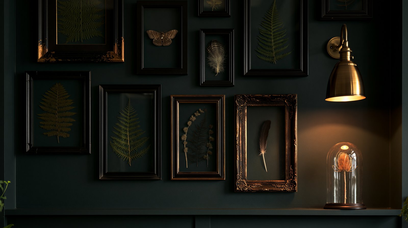
There’s a particular kind of wall that makes people stop in a hallway. Not a gallery wall in the Pinterest-perfect sense — nine matching frames in a grid, all white mats, all the same art. The one that stops people is older and stranger: a curiosity cabinet spread flat against the wall. Specimens and shadows. Frames that don’t quite match. Something under glass on the shelf below. It looks collected, not decorated — like it accumulated over years in the house of someone who notices things.
The good news is that it only looks like it took years. Here’s how the effect actually works, and how to build it in an afternoon.
Start with what’s in the frames
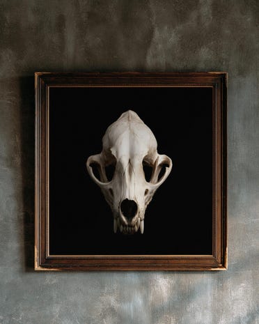
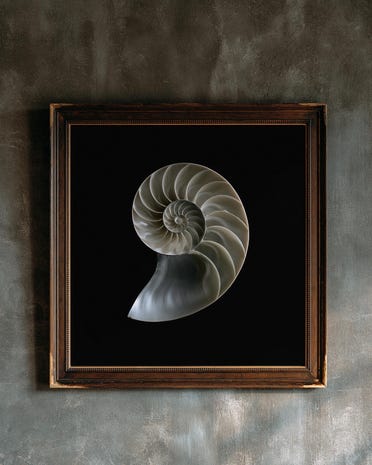
A curiosity wall is only as convincing as what’s inside the frames. The register you’re after is natural history — botanical specimens, moths, feathers, seed heads, skulls if you’re brave — rendered dark. Pale prints on white backgrounds read as farmhouse; the cabinet-of-curiosities look wants deep blacks and muted golds, the way specimens photographed in a Victorian study would look.
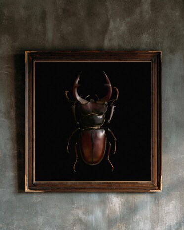
This is exactly what our own dark botanical and specimen prints are made for — herbarium stems on true black, moths and beetles lit like museum pieces. Start with three to five prints that share a palette but not a subject: a botanical, an insect, a feather. The variation between subjects is what makes it a collection instead of a set.
The frames should disagree — slightly
The single fastest way to kill the effect is to buy one frame six times. A real cabinet wall grows over time, and the frames should look like they did too: mostly dark, mostly ornate, but not identical.
Anchor the wall with one genuinely good frame — carved, black, with some depth to it. We keep coming back to this carved black wood frame with dark red bead detail — the beading catches light the way old furniture does, and the red is subtle enough that you only see it up close, which is exactly the kind of detail this style rewards. Put your strongest print in it. Then let the supporting frames be simpler — plain black, aged bronze, one gold if the room can carry it — in at least two different widths.
Hang them close. Two to three inches apart, not the gallery-standard five. Crowding is period-correct; a curiosity wall should feel slightly overfull, like there wasn’t quite enough wall for the collection.
Light one thing, not everything
Museums light individual objects, not whole walls — and that’s the trick that separates this look from ordinary decor. One small light over one frame instantly tells the eye this is a collection worth lighting.
A picture light does this without an electrician. This rechargeable brushed-brass picture light mounts over your anchor frame, runs on a battery, and dims from a remote — warm light only, at the lowest setting that still reads. The brass is brushed rather than polished, which matters; shiny gold hardware undoes the aged effect everything else is building.
Light the anchor frame only. The shadows on the rest of the wall are doing work — leave them alone.
Put something under glass
The detail that pushes the wall from “gallery” to “cabinet” is dimension: one real object among the flat prints. A narrow shelf or the top of a cabinet below the wall is enough — and on it, something under glass.
A glass cloche on a dark wood base is the classic move, and it earns its keep with almost anything inside: a dried seed head, a found feather, an old pocket watch, a piece of coral. The glass does something odd and useful — it makes whatever’s inside look chosen. The same dried stem that would look like clutter on a shelf looks like a specimen under a dome.
One is enough. Two cloches is a collection; three is a shop window.
The order of operations
If you’re building this from nothing: prints first, frames second, hang the wall, then add the light and the shelf object last. The common mistake is buying the atmospheric props first and the art last — then the wall is dressed before it has anything to say.
And hang the wall slightly lower than feels right. Gallery height is eye level for standing in a museum; a curiosity wall in a hallway or above a desk wants to meet you where you actually stand and sit. Three inches lower than your instinct is usually correct.
The whole point of this style is that it can’t be bought in one afternoon — it has to look like it wasn’t, anyway. Mismatched frames, one pool of light, something real under glass, and dark specimens that reward a second look. The wall does the rest.
From the shop
Prints from our own Duskwood Fell shop that suit this room. Instant digital downloads, printed at home or at any print shop.
This post contains affiliate links. If you purchase something through one of these links, Duskwood Fell may earn a small commission at no extra cost to you. Read our full Affiliate Disclosure for details.